
Heather Stewart, an award winning quilt teacher, spoke at my quilt Guild last week. Her talk focused on colour and value. According to Heather the secret to a successful quilt is the use of a minimum of 7 values. Now not all of those seven values will be the same colour but rather there should be a good mix of lights, mediums and darks. Value and colour are not the same thing!
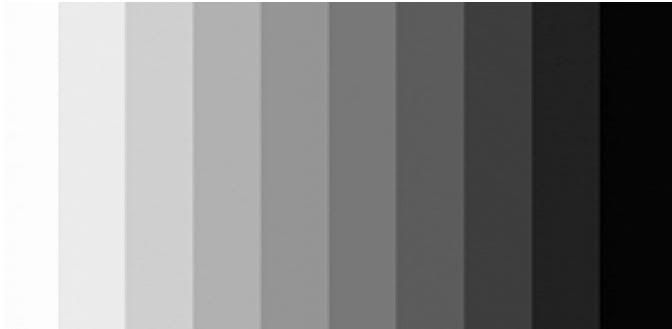
Value is the first thing that the eye sees, even before colour, so it is an important factor to consider when making a quilt.For a quilter value is the relative lightness or darkness of a fabric compared to another. Heather had a large colour wheel on which she demonstrated value on a scale of 1 to 10 with 1 being black, 10 being white and 2 through 9 were the grey shades in between. That is not to say that there are only ten values but rather that this is the scale that was used to demonstrate value. Between each value there are of course many other values, particularly in the lighter range.
We are all familiar with the colour wheel. The primary colours (red, yellow and blue) are in the 12, 4 and 8 o'clock positions on the wheel below. You cannot make a primary colour. The secondary colours are made by combining two primary colours and the colours that are created are orange, green and violet which are in the 2, 6 and 10 o'clock positions. Tertiary colours are a combination of a primary colour and a secondary colour. The tertiary colours are red-orange, yellow-orange, yellow-green, blue-green, blue-violet and red-violet. The tertiary colours are in the 1, 3, 5, 7, 9 and 11 o'clock positions.

The colours on a colour wheel are described as "pure colours". This term is related to the physical spectrum but for our purposes lets just say nothing has been added to them. When black, white or grey is added the terms shade, tint and tone are used respectively to describe the resultant colours. I'll bet you have a natural preference for one of these. I've often said I am drawn the the muddier colours and those are tones (colours that have had grey added to them). What about you? I'll bet a quick look at your stash will give you the answer!
Complementary colours are those that are opposite one another on the colour wheel (e.g. red and green, blue and orange, yellow and violet). Do you know how to make brown? Easy - you combine complementary colours. Depending upon the quantity of colour used the brown could be a warm brown (it would have more red, orange or yellow) or it could be a cool brown (it would have more blue, green or violet). When you make a quilt it can be very effective to use a complementary colour scheme however one colour would be used simply as an accent. A blue quilt with a little bit of orange will sparkle!
One final bit of information Heather shared was four colour recipes for successful quilts. They are:
Heather spoke about the concepts of base and tone. The eye sees white-base colours first and brown-base colours second. When a white-base colour is used it appears to advance because the eye sees it first. Try a simple experiment - place white fabric next to cream fabric of the same size and the white fabric will appear larger because the eye sees it first! You can repeat this experiment with any colour and the results will be the same. If you make a scrap quilt and use both white an brown base fabrics the white-base fabrics will appear to jump out at you. This is fine if that is the effect you want but if not the white may detract from the overall appearance of your quilt. A quilt made entirely with white-base colours will be vibrant and lively whereas a quilt made with brown-base colours will be softer, more muted and very much like an antique quilt.
- neutral and colour;
- light and dark (the most common recipe in quilts);
- warm and cool (a very effective combination) and
- colour and colour (e.g. yellow and red)
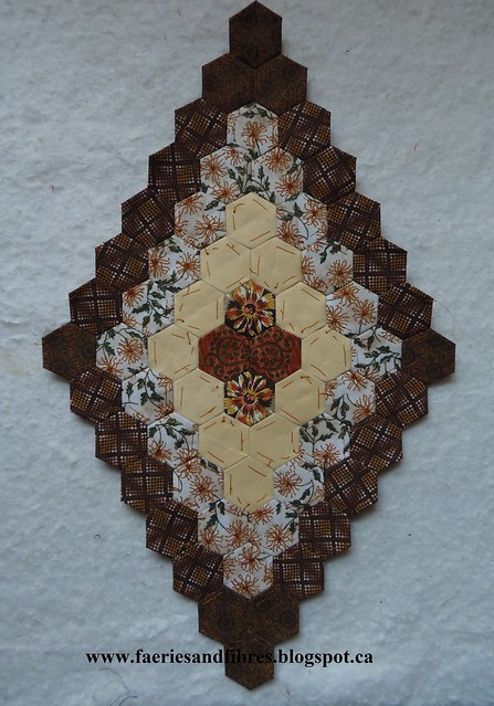
So why am I telling you all this? It to help you think about my Value Proposition QAL. I will not be showing you colour pictures of the hexagon blocks I made. Instead I will provide the block pattern and what I will show is the value rather than the colour. Work with the colours and prints that you have in your stash. The trick to making effective blocks will be to select dark fabrics where I show the darkest value(s), mid-value fabrics where I show mid-value and light where I show light. Just remember the term "dark" is relative which is to say the darkest patch must be the darkest of the fabrics you use in that block - it does not mean black or the deepest darkest of fabrics.
Finally it can be difficult to determine value when you are looking at two fabrics in different colours. If you have a red value finder this will be the time to use it! If you don't have one read my April 3, 2014 post for instructions on making your own value finder.

Tomorrow I'll talk about my fabric choices for the path in my Value Proposition quilt and fabric requirements for the path. I'll also talk a little about my fabric choices for the blocks. Until then, happy sewing!
Karen H
Finally it can be difficult to determine value when you are looking at two fabrics in different colours. If you have a red value finder this will be the time to use it! If you don't have one read my April 3, 2014 post for instructions on making your own value finder.
Tomorrow I'll talk about my fabric choices for the path in my Value Proposition quilt and fabric requirements for the path. I'll also talk a little about my fabric choices for the blocks. Until then, happy sewing!
Karen H
great information Karen, I have to say I think I gained good color sense from my Mom and my Grandmothers-they were all really good in putting colors together-and values are so important too-which I don't always pay attention to. My neighbor friend who is a painter and artist would look at my colors and tell me they don't go together-I would ignore her-and when finished all she could say was-wow those go together lol
ReplyDeleteI don't use white at all cause I don't like the brightness of it-I like softer neutrals-and I always go with earthy colors too-lol I am looking forward to your new qal as I think it will be perfect for what I had in mind for my civil war jelly roll
off to check out your link for the value finder
(Sorry for the long post)
I am finding all this information very interesting. A couple of years back, my friend Silve made a "brights and darks" quilt, which you can see here http://greatgrandmashotchpotch.blogspot.co.uk/2013/06/quilts-and-hand-sewing.html
ReplyDeleteIt has a gloriously scrappy combination of rich colours, which I love. Combining fabrics is quite an art I always think.
Nice explanation of color vs. value -- my general feeling based on my years of teaching and selling fabric to quilters is that value is the primary aspect that makes traditional quilt blocks work or not, while color seems to be more important in art quilts. Looking forward to tomorrow's intro to the new QAL!
ReplyDeleteGreat explanation. I need to find more than 24 hours in a day, your QAL is just getting too intriguing.
ReplyDeleteVery interested to follow along with this one. I love the greyed down colours, but lately am challenging myself with some brights. I find what i use are of similar tone and am achieving contrast with black and white prints. I need to learn to use pastels more, i rarely buy them because i can't use them.
ReplyDeleteHi Karen you must be a fall, I am a spring in the colours. Lol I always love your muted colours but I always make bright quilts lol. When I buy fabric it's always clear colours. Yet I try to work at times with muted colours and get discourages with them . I so love your hexagon you are making they are simply gorgeous.
ReplyDeleteHugs Bunny
yes I am drawn to the softer antique looking colours too, I am however making a quilt in bright 1930's prints, so out of my comfort zone but I am loving it!
ReplyDeleteGreat post. I love every color, shade, value, tone, etc. I have all kinds of quilts. But I dress in black and navy most of the time. I am trying to add more colors to my closet lately. Looking forward to the QAL. Thanks again.
ReplyDeleteThanks for the info, Karen - very useful.
ReplyDeletePS - I don't know why you say you love the browns - they are gorgeous of course and as a fall girl myself - love those colors, but I consider both your Soupçons as bright! Love the colors there, too.
ReplyDeleteGrr - what I meant to say was "don't know why to say you always gravitate to browns" in the message above. And going through your gallery of fab quilts, I find Lazy Punk and Loopers bright indeed. You just love browns - I see that - have a little bit in almost all of them.
ReplyDelete